
No Broker Design System
Team: 5 People
Contribution: Research, Audit, Brand Strategy, Design System, UI Design and Prototyping
NoBroker removed the broker. We wanted to see what happens when it removes the judgement too.

Auditing NoBroker's interface to find gaps, then rebuilding it as a system built to make everyone feel at home.
(Context)
NoBroker runs rentals, buying, cleaning, packers and more, each built at a different time by different teams. The product grew fast. Its interface grew without a shared rulebook. This project asks what the system would look like if someone wrote it down.
(Research)
Research began with the screens, not a template. Every page across web and mobile was captured, tagged and compared, so we could see what repeats by design and what repeats by accident.
(Users)
Users are renters, buyers and owners who want different things from a home, but they hit the same problem. Broad labels decide who fits before anyone gets to explain. They weren't looking for a listing, they were looking to be included.


Every screen was tagged by color, typeface, components, icons, grid and elevation. That let us separate what NoBroker decided on purpose from what drifted by accident.
NoBroker has a design system in principle. In practice, every screen drifts.


The same job gets rebuilt into a different-looking component, every time. Buttons, icons and cards are named well on paper. On screen, near-identical jobs ship as visually unrelated components.
Research didn't just stop here.
Alongside the audit, we looked at how people search, to find where the interface fails them and not just where it looks inconsistent.
A property can match the checklist and still not fit a life." "Missing information becomes a reason not to enquire." "Restrictions are discovered only after time is invested. That is why we wanted to bring inclusivity in the app.

Introducing A home for everyone
This revamped version of no broker is designed with a catered filtered system, in a way, that it gets rid of the strict formal vibe that makes you feel pressured and rushed, and makes finding a home feel exciting and welcoming. A website with the vibe of openness and joy in house hunting, not the old vibe of almost moving and finding out your dog is not allowed.

Color Palette
The palette balances trust, openness and joy. Off white feels welcoming, deep blue builds trust, and light blue adds calm. Neon yellow brings energy, and black grounds it all with structure.

Typeface
The typography combines bold, rounded headlines with clean, readable body text, creating a modern and friendly voice. This balance makes the brand feel approachable, confident, inclusive, and easy to navigate.

UI kit
Our components create a consistent, flexible interface across the platform. Clear buttons, cards, forms, navigation and controls make interactions intuitive while maintaining the brand’s friendly, modern and welcoming personality.

Spacing
A consistent spacing system built on clear, repeatable increments creates visual rhythm and hierarchy. It keeps layouts balanced, improves readability, and ensures consistency across every screen and component.

Illustration, Imagery and language
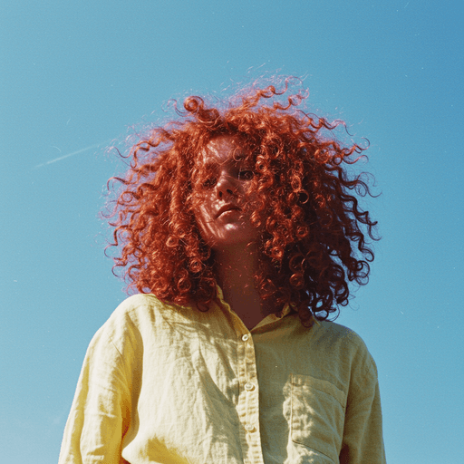
Warm images, plain words and playful line art, so house hunting feels like finding your place.

Prototype
Tools used Figma